7 1960s Interior Design Ideas: Decor Inspiration (With Pictures)
-
Kristin Hitchcock
- Last updated:
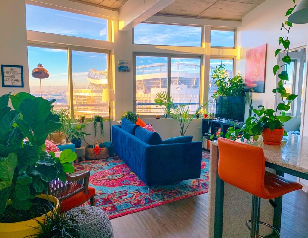

1960s design was a reaction against the traditional, conservative styles of the previous decade. The 1960s marked a period of immense social and cultural change, and this was reflected in the way people decorated their homes.
Often, you’ll see lots of vibrant colors, bold patterns, and minimalist furniture (instead of the ornate pieces used in the past). Sometimes, this design may even try to look a bit “futuristic.”
Below, we’ll explore several key elements of this design style.

The 7 1960s Interior Design Ideas
1. Pop Art Influence
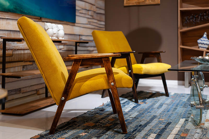
It doesn’t take much imagination to see how the pop art movement inspired 1960s décor. Often, this style is a departure from traditional décor, and it may even reflect the era’s fascination with mass production (which was new at the time). Drawing inspiration from the works of artists like Andy Warhol, Roy Lichtenstein, and Claes Oldenburg, interior design took on a bold, vibrant, and often whimsical character.
It was common to see larger-than-life pictures that really popped. Some of these may have been iconic imagery of the time, such as comic book-style illustrations and even advertisements. Bold colors and patterns were utilized in the décor when possible, including in the prints and pictures chosen.
2. Colorful and Bold patterns
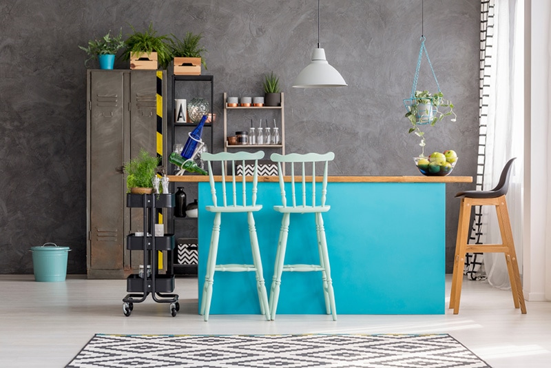
Colorful and bold patterns are a hallmark of 1960s décor. This era loved individuality and often expressed that with dramatic colors. Geometric shapes, abstract motifs, and swirls were extremely common. Often, they adorned everything from the furniture to the walls.
The use of bold patterns extended beyond mere aesthetics—it was a form of self-expression and a means of defying conformity. These patterns often intersected with the Pop Art movement, bringing everyday imagery and graphics into the realm of interior decor. Tangerine oranges, electric blues, and lime greens splashed across textiles and wallpapers.
3. Minimalist Furniture
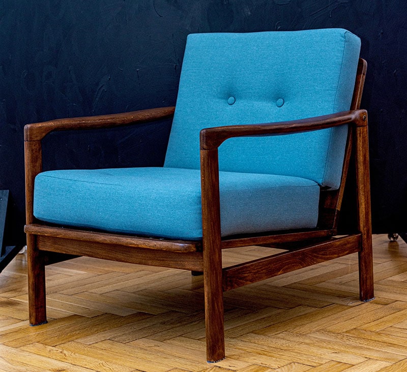
Often, 1960s décor doesn’t include very ornate furniture. Instead, it’s pretty simple. Often, the designs were purely functional, though they may “pop” in color and pattern. Furniture was starting to be mass-produced, which meant it had to be minimal.
The minimalist furniture of the 1960s also emphasized ergonomic comfort, recognizing the importance of practicality in everyday living. Chairs, sofas, and tables were designed to provide maximum comfort without sacrificing style. The attention to comfort and functionality paved the way for the enduring appeal of many mid-century modern furniture designs.
4. Open Floor Plans

Open floor plans came from the 1960s. This meant that walls separating rooms were removed, connecting the living room, dining area, and kitchen into one big space. This design style is very popular today, but it came from the 1960s originally.
This design style creates a sense of openness and makes moving around easier. Families could interact more, and light could flow better between spaces. You’ll find tons of examples of open floor plans in the 1960s, though not everyone utilized them, and they weren’t as “open” as what we have today.
5. Futuristic Design
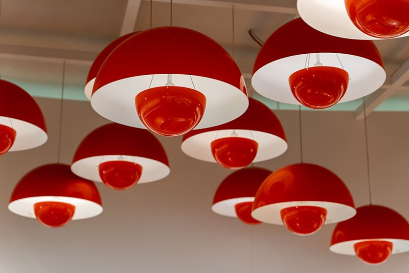
Often, 1960s design was trying to be modern. Therefore, it had a bit of a futuristic design. Often, those in the 1960s were excited about technological innovation, which led to them incorporating “space age” design into their homes.
Think of sleek and shiny materials, unusual shapes, and imaginative designs that seemed to come from a world of tomorrow. Furniture and decor embraced a modern and space-age aesthetic, with a focus on cutting-edge materials like molded plastics, acrylics, and chrome. Light fixtures took on unique and futuristic forms, resembling flying saucers or abstract shapes.
The goal was to capture a sense of innovation and progress, and this style continues to inspire designers who seek to blend modern functionality with a touch of the extraordinary.
6. Shag Carpets and Textures
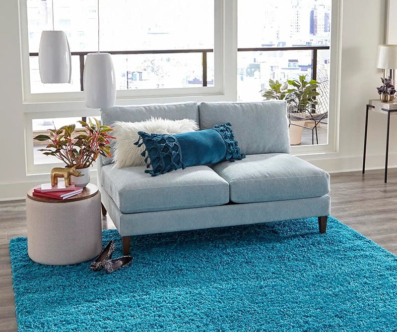
One of the best-known elements of 1960s design is the shag carpet. These carpets were deep, plush, and created a soft, textured surface. Shag carpets added a cozy and luxurious feel to living spaces, as they provided a unique sensory experience through their tactile quality.
Shag carpets also played a role in the colorful and eclectic aesthetic of the era. They were available in a wide range of colors, allowing homeowners to choose bold and vibrant shades that complemented the overall design scheme. The texture of the shag carpets added an element of visual interest, breaking up the visual monotony of flat surfaces and creating a dynamic contrast.
Of course, shag carpet isn’t as common today. You do still sometimes see it, though, and we can thank the 1960s for it.
7. Natural Elements
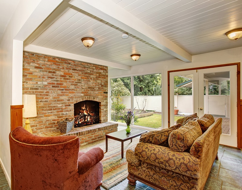
In the 1960s, designers also focused on natural elements. Plain wood was common, for instance. This trend may have been a reflection of the era’s increased environmental awareness, which was a counterpoint to the rapid urbanization of the time.
Materials like wood, stone, and exposed brick were prominently used in interior design. Wood, with its warm and organic qualities, was often featured in furniture, flooring, and paneling. It provided a connection to the earth and brought a sense of authenticity and comfort to living spaces. Similarly, stone and brick added an earthy texture and a rustic charm to interiors, reminding inhabitants of the natural world’s raw beauty.
Sometimes, actual plants were used. Indoor gardening became increasingly popular at the time, and spider plants were common in many homes. Natural light played a crucial role as well. Large windows, often left uncovered or with minimal window treatments, allowed ample sunlight to stream into rooms.

Final Thoughts
The 1960s marked a transformative era in interior design, characterized by a departure from traditional norms and a celebration of cultural change and individual expression. Influenced by movements like Pop Art and the Space Race, 1960s interior design featured a vibrant array of elements.
You’d find colorful, bold patterns that were much different from the subdued colors of the past hundred years. The people in this era emphasized individuality and often showed that emphasis with the colors they chose.
Open floor plans also began in this era. They weren’t as open as what we have today, but the concept did start here. Other things didn’t live on, though, like shag carpets!
- Related Read: Ways to Incorporate Steampunk Décor Ideas
Featured Image Credit: Steph Wilson, Unsplash
Contents
